Responsive website checklist: 15 points to test
A website is responsive when it can be used without zooming and without horizontal scrolling on everything from a small phone to a wide screen. Here are 15 points you can go through in an afternoon, and most only need your own phone and the browser's developer tools.
It is worth doing properly because Google uses the mobile version of your page for indexing. Content that only exists on the desktop version does not count. Source: Google Search Central, "Mobile-first indexing best practices", read 22/11-2026.
Layout and structure
- The viewport is set. The page has
<meta name="viewport" content="width=device-width, initial-scale=1">in<head>. Without it, a phone shows a scaled-down desktop page. - No horizontal scroll. All content fits within the screen width. WCAG 1.4.10 (Reflow) requires content to work at a 320 CSS pixel width without horizontal scrolling (apart from things like large tables and maps). Source: w3.org, read 22/11-2026.
- The menu works on mobile. It opens and closes, works with a keyboard, and does not cover the content when closed.
- Tables are readable. They scroll horizontally in their own container or reformat to cards.
- Forms are usable. Fields are large enough, labels are always visible, and the keyboard matches the field type (
type="email",type="tel").
Text and typography
- Text is readable without zoom. Body text of at least 16 px. Zoom must not be disabled with
user-scalable=noeither. - Headings and long words wrap. No long words or URLs pushing the layout past the edge.
- Line spacing is generous. Around 1.5 for body text.
Images and media
- Images scale.
max-width: 100%; height: auto, andwidthandheightare set so the page does not jump while the image loads. - Images are sensibly sized. WebP or AVIF, and
loading="lazy"on images below the first screen. The top image (the LCP element) should not be lazy-loaded. - Video and embeds follow the container. Use
aspect-ratioor a responsive wrapper.
Interaction and touch
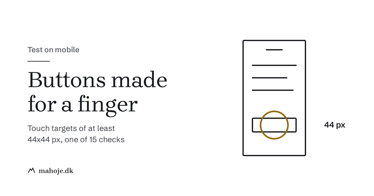
- Buttons and links are big enough to hit. WCAG 2.2 (2.5.8, level AA) requires at least 24 x 24 CSS pixels, with exceptions. The stricter rule (2.5.5, level AAA) is 44 x 44. Google's web.dev recommends around 48 px. I use 44 as the target. Sources: w3.org and web.dev, read 22/11-2026.
- There is space between clickable elements. So a finger does not hit the neighboring link by mistake.
- Nothing requires hover. Anything shown on hover must also open with a tap or the keyboard.
Speed
- The page is fast enough on mobile. Google's thresholds for a good experience are LCP of 2.5 seconds or less, INP of 200 milliseconds or less and CLS of 0.1 or less. Source: web.dev/articles/vitals, read 22/11-2026.
A responsive page that loads slowly or jumps around still feels broken. Missing image dimensions, swapping fonts and banners that push content down often cause poor CLS. How to measure and fix the numbers is covered in the Core Web Vitals guide (Danish only).
How to test
- Your own phone. Go through the whole site as a customer: the front page, the menu, a form and checkout if you have a shop. Turn the phone sideways and back.
- Chrome DevTools. Press F12 and switch on device mode. Test at 320, 375, 768 and 1024 px, and also drag the width down slowly to find breakpoints that fall between the standard sizes.
- PageSpeed Insights. Shows numbers for mobile and, if the page has enough visits, real user data from Chrome.
- Zoom to 200% and 400%. This shows whether text breaks and whether anything gets cut off.
Common problems and solutions
| Problem | Solution |
|---|---|
| Text too small | Body text of at least 16 px |
| Buttons too small | min-height: 44px and padding |
| Images too large | max-width: 100%; height: auto |
| Menu doesn't work | Test the menu with taps and keyboard on a real phone |
| Tables break layout | Wrap in a container with overflow-x: auto |
| Page jumps while loading | Set width and height on images and reserve space for banners |
When is it time to fix more than details?
If the site fails more than five of the 15 points, the theme or layout is usually the problem, and small tweaks are not enough. A site that does not work on mobile loses visitors every day. You can see what a new site costs in the pricing guide, and how I work mobile-first is described under responsive design.